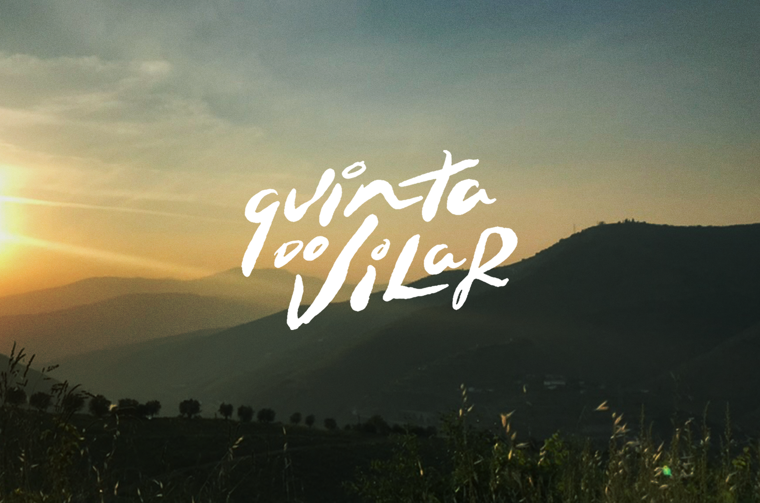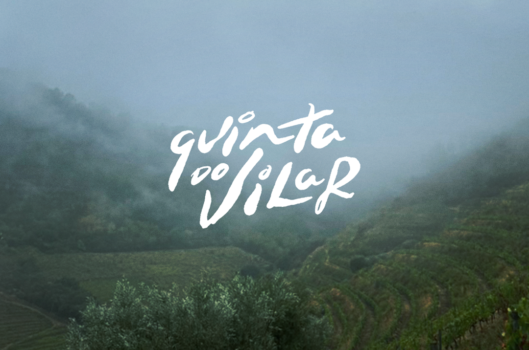
Quinta do Vilar · Brand Identity
Brand identity for Quinta do Vilar, a winery and farm in the idyllic vineyard region of Douro, Portugal.
The objective of this project was to create a logo for the farm, and a visual system and social media identity system. We divided the posts into two main categories — one was promoting events on the property, and second was sharing aspects of life on the quinta including wine production, farm animals, and daily ongoings.


A hand-lettered wordmark anchors the brand. We sought to embody the flow of the landscape, as well as seasons of growth and retreat definitive to life on the farm.

A set of branded backgrounds use abstract illustration and lettering as texture, for text-centric content promoting events on the quinta.
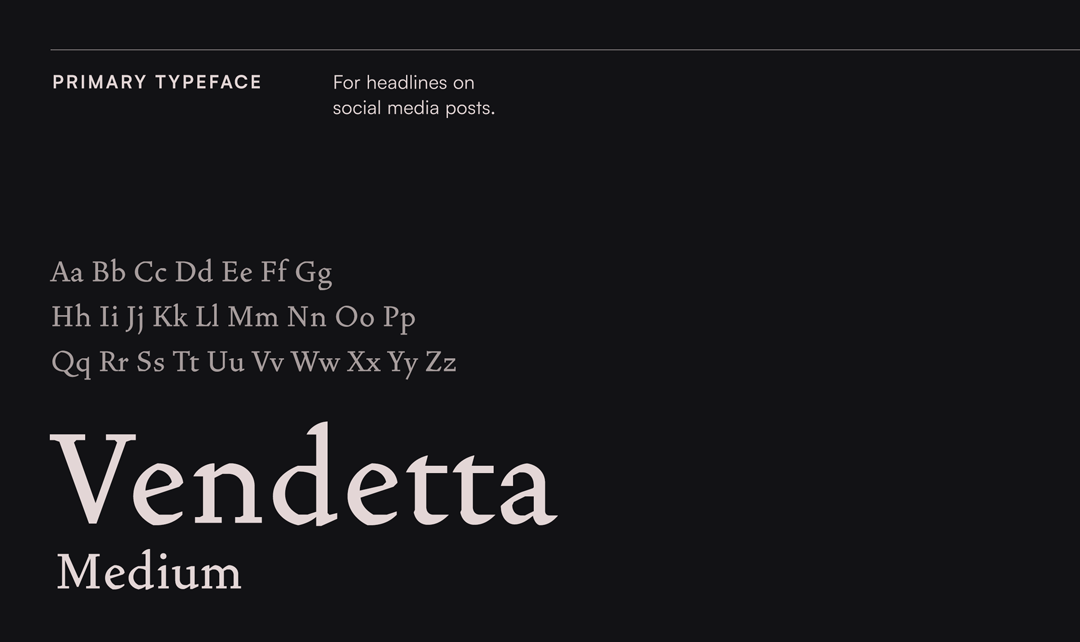
I chose Vendetta as the brand’s primary typeface for its subtly angled edges reminiscent of a pen nib across a textured page. It’s an elegant serif that carries a rustic roughness, a sentiment that matches the vineyard perfectly.
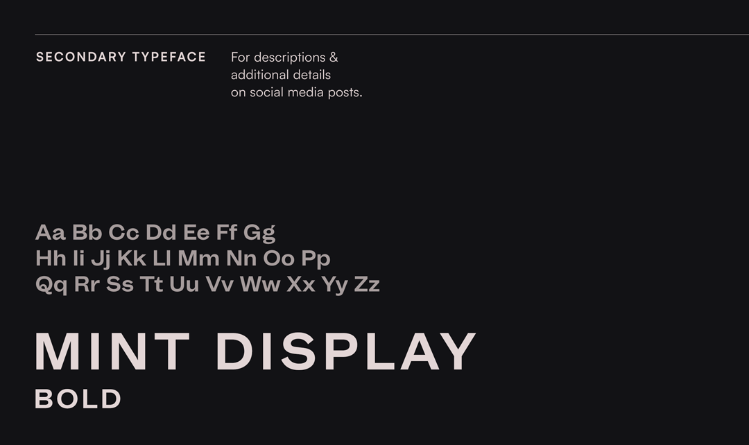
Mint Display, here used in all caps, is a rounded and wider sans serif. The width gives a whiff of playfulness to the otherwise pragmatic subtitles.

A rough-cut photo framing device spotlights photo posts in a way that feels organic and fitting to life on the farm.